


Design & Color: Part I of II
- Published: March 01, 2007, By By David Argent, Contributing Editor
Process Management
It is interesting to examine the world of those responsible for conceiving and managing brand colors and designing the incredible array of attractive packaging that is now available. Here are three quotes from Package Design Magazine (packagedesignmag.com):
Brand Identity: “Brand identity consultancies work with color in a very meaningful way. In any branding project, from initial conception through the entire life of the brand, color is a vital element in the identity of that brand. Branding is critically important as it positions products and services to reach a desired consumer demographic.…” (Ted Mininni)
Color: “…a color consultancy…stresses the wide influence color wields. Marketing research indicates that over 80% of visual information is related to color. In other words, color conveys information. It identifies a product or a company, as well as the quality of the merchandise and much more. The right color is indeed worth a thousand words.” (Ted Mininni)
Design: “Years ago, the limitations and lack of flexibility in packaging equipment hindered the design process. With the constantly evolving technologies, however, the possibilities are endless. Designers should push their creative minds within the framework of the marketing strategy and not fight preconceived restrictions. From the small proprietary features to the illustrious designs, designer, manufacturer, and supplier can work together towards revolutionary packaging designs. These are the designs that stop us in our tracks.” (Marianne Klimchuk)
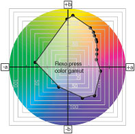
These are very lofty ideals that sometimes lead to disappointment in practice, due to fragmentation of the packaging workflow. Many times the processes within converting are defined and in control but are not linked to other steps within the overall workflow. One of the basic problems is that designs are produced in color space not achievable on the printing press and actual substrate. In the January 2007 column, the concept of linking color to specific ink pigments was introduced. Most packaging converters operate with a palette of at least 12 pigments (see diagram). These would include those specified, e.g., by Pantone or by FIRST1.
Other pigments are added to the palette for reasons of economy in use and for resistance properties. These pigments define the color gamut available from the press, and the diagram illustrates a typical ink color gamut for a flexo press, with each dot representing a discrete pigment.
Every device has a different gamut. The problem frequently becomes one of moving the design through a production workflow where every device, such as scanners and monitors, has slightly different color gamuts. Although there may be large areas where the gamuts overlap, there are also areas that do not. Ultimately, the only color gamut that counts is that of the production press—so why not start with this and work back through the workflow, calibrating each device along the way?
Next month we will review issues around the calibration of a production workflow.

David Argent has 30+ years of experience in the converting industry. He specializes in process analysis and improvement with particular emphasis on ink and coating design and performance. Contact him at 636/391-8180; djvargent@sbcglobal.net.